Hot New Chart Alert: Who Ran the Fastest Lap on Each Lap of the Race?
Lap Raptor has a new chart on a new tab.
Over Easter I had some time to pass while flying transcontinental between California and my home and native land. With free high-speed Wi-Fi, I fired up Windsurf and asked it to make a bunch of new tabs and charts on the Lap Raptor race page. When they've settled, I'll call more attention to them. They're there for your perusal.
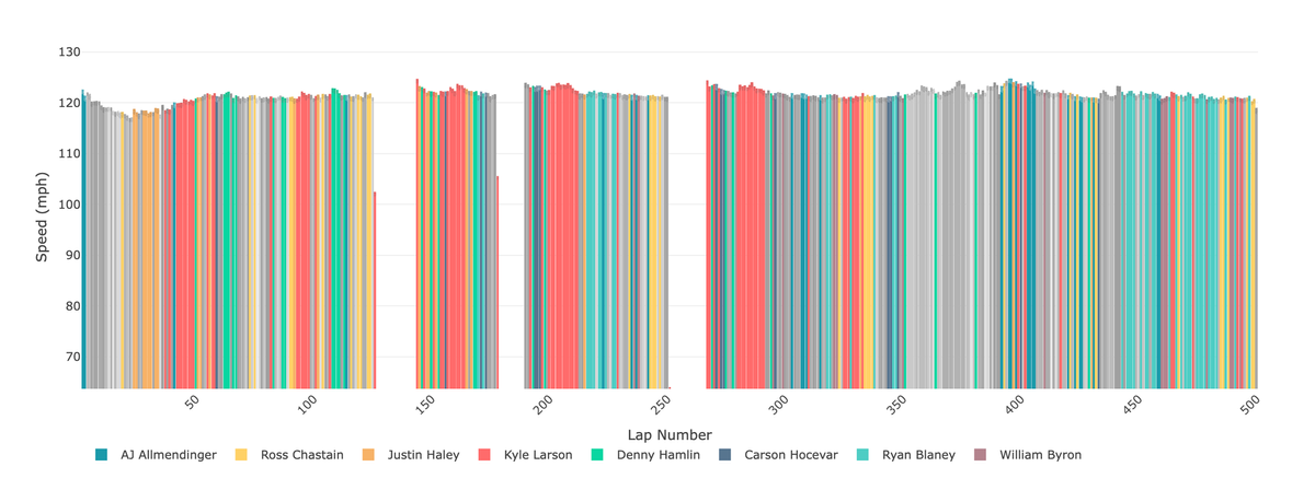
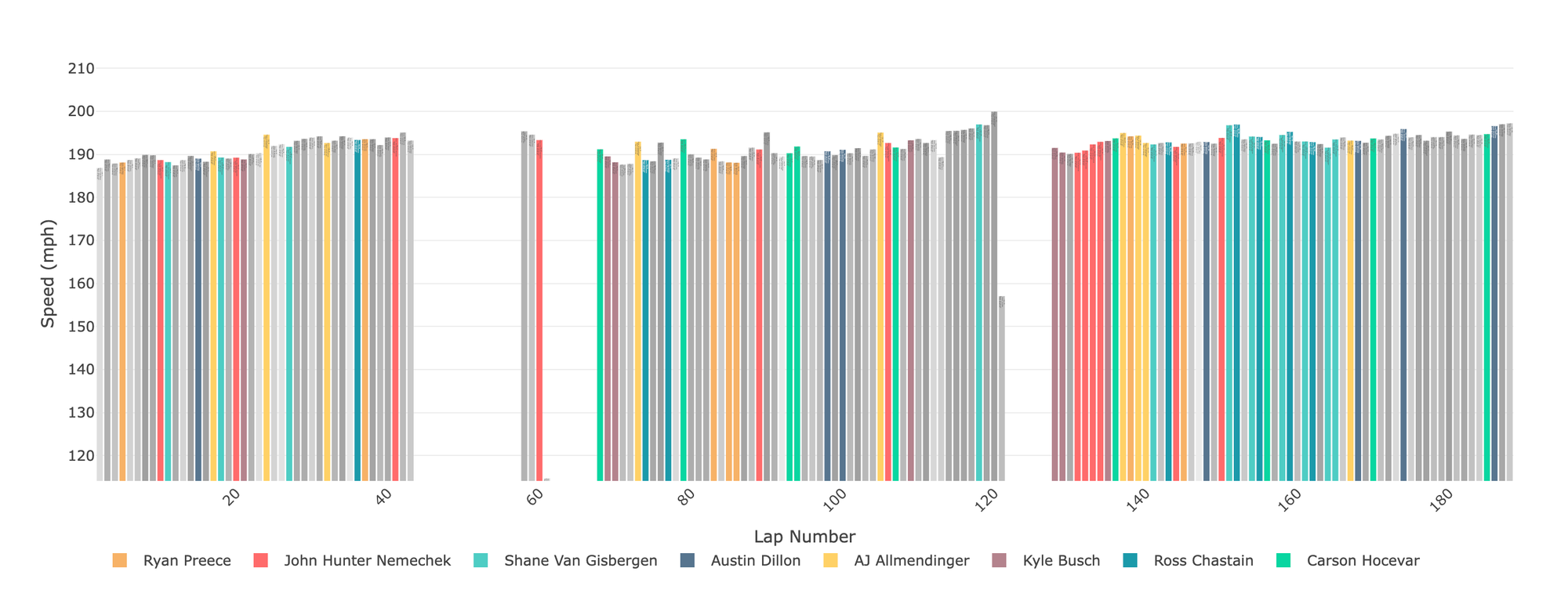
The one I am happiest with is the newest. On the Fastest Laps tab of the race page — take the spring Bristol Cup race, please — you will find a list of who, according to the Lap Raptor lap-by-lap data, ran the fastest lap speed / time by laps completed (which, in effect, is lap number, but not really: if the leader is on lap 30 and I'm one lap off the lead lap, then my lap is scoring on lap 29, not 30). The list is useful to see who was good at the different stages of the race. If you look at the table, you'll see a lot of Kyle Larson at different points and a lot of Ryan Blaney near the end.
But that's a lot of reading. The eye enjoys color. Hence the bar chart you see above. At the top of the Fastest Laps tab, you'll now see a chart like above, which shows a somewhat color-coded depiction of the tabular data. The eight drivers with the most laps led are assigned a color, while the rest are given various shades of grey. In the page, you can hover over any given lap to see more information.
I find the chart more useful because it tells me at a glance who was best and when. It has the side benefit of showing overall lap speed trends. In this spring Talladega graph, you can see when fuel saving ended.
The chart is live now, as are many others.